Creating the Perfect Playroom: California Casual Style
I'm excited to kick off our latest home project on the Coastside Home blog: Jude's playroom!
The Space
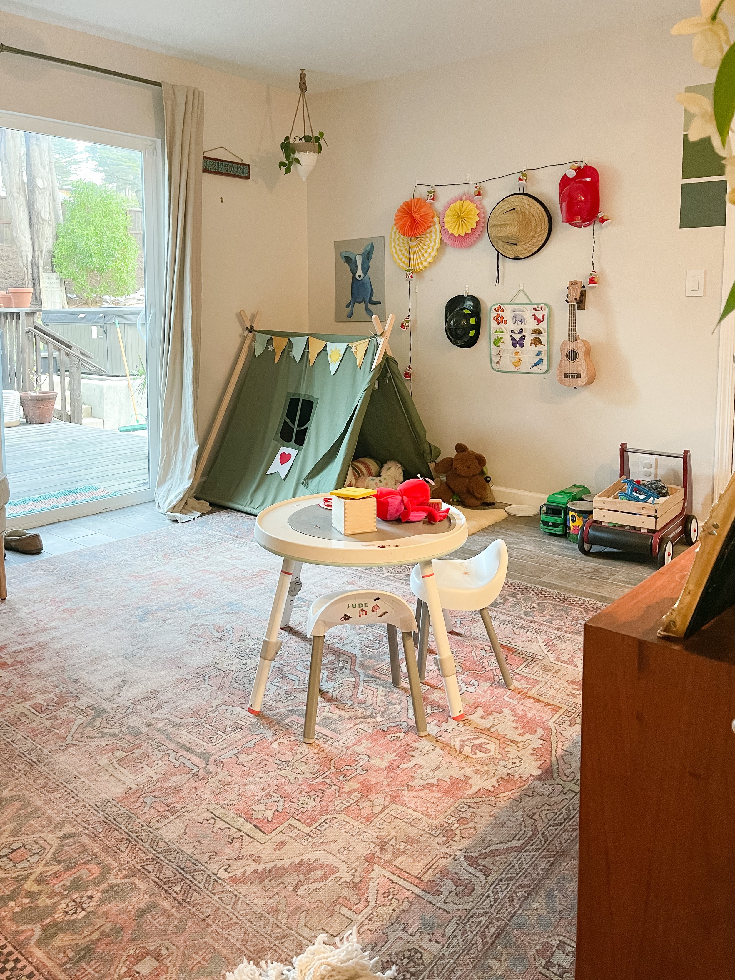
Our playroom is not technically a room per se… it’s part of an open floor plan, but is thankfully hidden behind a pony wall. Our home is relatively modest, clocking in at just over 1,500 square feet. And with kiddo number two on the way I’m feeling more pressure to add function to every square inch of it. This space will need to serve both as a toddler-friendly play area with lots of options to release energy, as well as a baby-safe “yes” zone that can be used for tummy time.
The playroom is adjacent to the kitchen, dining room, and living room, so we’re aiming for a design that flows seamlessly with the California Cool vibe of rest of the house… while also being fun! Think punchier colors with a slightly retro-surf inspired aesthetic. The space is 10x10 with short ceilings, so we're looking for decor and a layout that will make the space feel airy and open.
The Inspiration
Over the past month, I’ve pulled together a mood board that combines elements of all of my favorite kids spaces designed by some of my favorite designers. Lets take a peek!
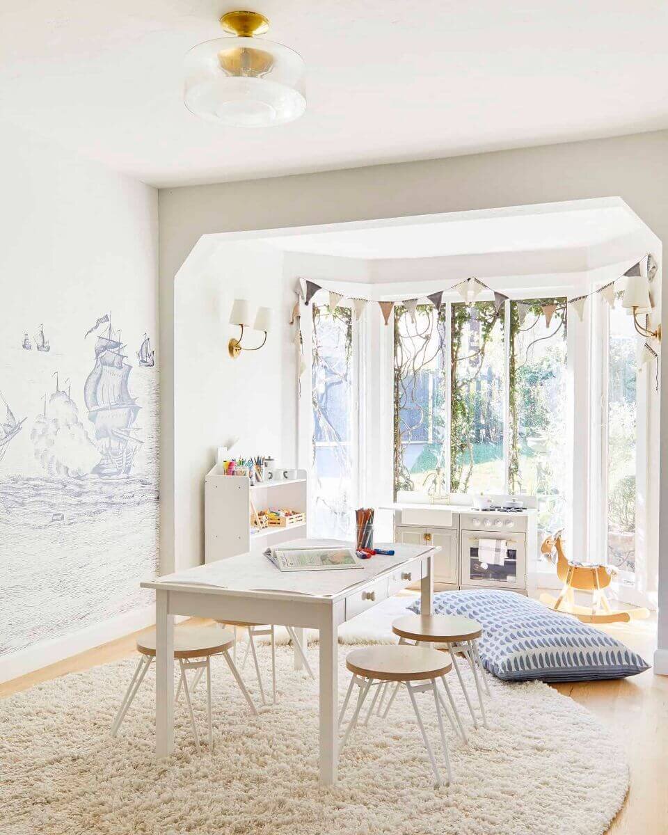
Looks and feels like the rest of her home. Love the nautical, scandi vibes and all of the thoughtful functionality built into this room. Practical for kids, toys on display which means they’ll actually use them. Cozy rug and floor pillows for easy lounging.
Designed by Emily Henderson
Love the texture, the rattan chairs, the layered jute rug, and the art framed on the walls. The neutral background lets the colors from the books and toys shine. Also love the patterned accent wall!
Designed by Chrissy Marie
The Plan
My mood board attempts to balance a laid-back California Casual aesthetic (light and bright walls, natural materials, layers of texture) with more color and whimsy than I’ve used in the rest of the house.
Board Sources: Play Sofa, Nugget | Shelves, West Elm | Table and Chairs, Lalo | Pikler Triangle, Amazon | Vintage Credenza, similar | Jute Look Rug, RugsUSA | Patterned Rug, second hand | Sconce, World Market | Art and Pennants, etsy | Toy Bins, Target
Since I’m in my third trimester, we’re keeping the DIY projects in this room pretty light. We’ll be patching and painting walls to match the rest of the house (BM Simply White FTW), designing a hand-painted mural, and macrameing some boho plant hangers. My goal is to have the playroom finished by mid-January… though I’ll be working around my full-time job, parenting/potty training, and prepping for maternity leave.
In next week's post, I'll share painting progress and a sneak peek at how we're keeping toys organized and clutter-free. You can also follow along with our progress in real-time on Instagram stories.
Stay tuned for more updates on our playroom makeover!
Jamie


